
Tuesday, 20 April 2010


Evaluation
What have you learnt about technologies from the process of constructing this product?
I hadn’t used a photo manipulation software before so using adobe Photoshop (PS) was new and difficult to grasp at first but after practise I swiftly picked up the skills required to produce a front cover, Contents page and a double page spread. Tools used to change and blend colours into each other (gradient) is used within my magazine.
PowerPoint and Microsoft word were software that I was able to use easily as I have been using this type of software long before I began this coursework.


Tuesday, 6 April 2010

Double page spread analysis

This is a double page spread from an issue of NME magazine, featuring British pop/rock artist Lily Allen. Through the useage of dark makeup around the eyes and jet-black hair as well as unglamorous clothing, Lily Allen is portrayed as a traditional rock star. The mise en scene of this image allows us to have an understanding of what type of magazine this is. Lily Allen's posture also represents the stereotypical rockstar, due to her relaxed and uncaring pose. Despite this, she is looking at the camera, thus directly adressing the reader.This double page spread has many atypical traits. One of these is that it only has one image, although it consumes an entire page. The significance of this could be to emphasise and represent the current popularity and importance of Lily Allen. The editor has also structured the spread similar to that of a poster, so that it is aesthetically pleasing, which in turn attracts readers. As a result of
the size of the image of Lily Allen, the interview is limited to a small amount of space. This has the potential to attract a lot of readers many words on a page has less appeal to a reader. In addition to this, the layout of the article’s title looks very attractive as the text is laid out in blocks. The aesthetic appeal of the spread should catch the casual browser’s eye, due to the placement of
the image and title, as well as the limited text.
However, this double page also has typical traits, such as the text being laid out in columns. This makes the text easier to read and follow. Another traditional feature of the magazine is that it has a direct mode of address. It is vital that a direct mode of address is obtained within the interview, so that the reader feels more involved and thu
thus more entertained. The text also maintains its appeal to its target audience, which keeps the reader satisfied.
Wednesday, 31 March 2010
Contents page analysis
 The main purpose of a contents page is to allow the reader to find what they are looking for, this is achieved by making the layout user friend and making the typography easier to read and stand out. This contents page also has a brief description of what each page is about, this is very effective and gives the reader a quick peek at what is on that page is about so it doesn't waste the readers time. This magazine contents page has a typical convention of other contents pages and that is it has an image of the what concludes to be the main feature of this issues magazine. However, most contents pages do not include a issue number and date,and by including one it can save us time instead of turning back to the front cover to view these additions it can also be argued as a flaw as it can be annoying to the reader as it looks like an addition piece of text. The medium long shot of 50 cent shows direct address and entices and engages the reader.
Saturday, 13 March 2010
First Article draft
Young star of UK Hip-Hop Teflon had undergone one of our exclusive interviews releasing info about his earlier life which not many people have heard out in the open.
‘Stability had never been a word I could have used for my life at home’
Rapper Mike Jones A.K.A Teflon had a rocky upbringing in one of the notorious Liverpool housing estate in toxteth, but through pure perseverance and a motive to drive him forward he made it through and found a passion for music. Having owned the underground region of Hip-Hop for a while Teflon got signed by an independent label. He then smashed the charts and stayed number one for 3 weeks with his new single ‘Pledged to the streets’
What motivated you to become a rapper?
‘Well I always liked rap myself and enjoyed hearing about how life was so hard and see how that rapper prevailed and began to make a legal living and source of money because the majority of rappers that make it were making an illegal living. I wanted to be in a good position and no longer live the rough and brutal life I had been living beforehand. I guessed I could speak truthfully about my hard life and interest others how I was interested.’
I understand there was a massive bidding war because all the major labels wanted to sign you. Who did you sign with? And how are you getting on?
‘Well I signed with Sony record label Columbia. A great record label with the likes of Beyonce, Leona Lewis and Alicia keys, I haven’t met any of them yet but I am sure my future will lead me to have them in the presence of a same studio. My record label is trying to broadcast me out in America as well as England and if the states like me then I am in business. At the moment they are seeing if I get any ratings from my music being played on the radio and from there we will make a move. I have met Gucci Mane and made an acquaintance. I am also due a little mentoring session with lil’Wayne something I am looking forward to. If I say so myself I think I am getting on great.’
Is there any advice in which you can give to people who are following the dream you were pursuing?
‘Yes. Never stop looking forward. Always stayed focused on what’s ahead of you, try and spend minimal time on what you have done already and try and stayed ahead of the others you are competing with. I was so focused on what lay ahead I didn’t take a break from writing my music until my label told me I could afford to take a break from all my hard work. What you put in is what you get out that is the advice I will give to others who are pursuing the dream of becoming a music artist or anything really.’
Thursday, 4 March 2010
Wednesday, 3 March 2010


Wednesday, 24 February 2010
Mise-en-scene Planning

I have chosen this as a prop in my magazine the actual Prop won't look like this. This is a baseball cap and is associated with the younger generation and hip-hop artists. It is supposed to be considered as being cool and is seen as being mysterious and concealing.
Front cover planning
 I have taken this picture from the Internet as a guide for what I want to use as my back ground on my magazine. I will take a pictures of some boarded up houses near me. The reason i want to take this picture is because my it relates to the stereotypical background of my genre and it will be an insight used to portray the artists background. This picture represents the conventions of a drug dealers lifestyle. Boarded up houses are used as a shelter from police to move drugs and craft them. This should interest the audience as this is a stereotypical rappers lifestyle before they become an artist.
Tuesday, 23 February 2010
Monday, 22 February 2010
First Draft of Front cover
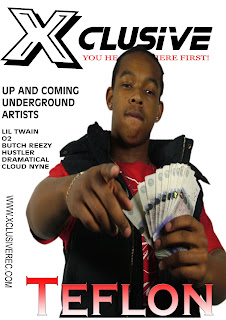
 This is the first draft of what my front cover of my magazine will look like. I have called it 'Xclusive' this is because I have reason to believe that my magazine will have the most recent releases of hip-hop before other magazines from my sources, I have named it 'Xclusive' with an X to make it more user friendly and meet the hip-hop stereotypical slang used aimed at my target audience. I have ideas of making the artist be included in the title of my magazine by making him/her cross their arms in an X fasion to include the artist more with the making of the magazine to try an invoke a trend within the magazine to make it more popular amoungst fans of this magazine.
Other things the magazine includes is sell lines and stories of the artist featured on the front cover. It also has a slogan 'You heard it here first' . It also has sneak previews of the contents of the magazine on the front cover and some minor headlines. The website of the front cover will be on the bottom of the magazine.
Monday, 8 February 2010
The contents page informs the reader of the regular and unique features included in the magazine, promotes the magazine, and creates a brand identity for audiences to identify with. This contents page subverts from the stereotypical connotations of a conte nts page because they have contents spelt 'contex' and the image is slightly to the side. An additional convention that is found in a majority of contents pages is an image(s) this is important as it draws the readers attention as it is usually someone who is associated with the genre of the magazine. This contents page includes an image of a Hip-Hop icon Ludacris. However most contents pages do not include a issue number and date this could be a good idea as it allows us to see when it was made without going back to the front cover, this can also be argued as being annoying to the reader as it looks like an addition piece of text which would make the reader dis-heartened to carry on reading the page because it looks to long and a lot to take in. The contents page also has sub headings giving the reader the ability to select a specific section in which interests them the most the also alternate the colour of the lines to make it easier for the reader to read the words.
 nts page because they have contents spelt 'contex' and the image is slightly to the side. An additional convention that is found in a majority of contents pages is an image(s) this is important as it draws the readers attention as it is usually someone who is associated with the genre of the magazine. This contents page includes an image of a Hip-Hop icon Ludacris. However most contents pages do not include a issue number and date this could be a good idea as it allows us to see when it was made without going back to the front cover, this can also be argued as being annoying to the reader as it looks like an addition piece of text which would make the reader dis-heartened to carry on reading the page because it looks to long and a lot to take in. The contents page also has sub headings giving the reader the ability to select a specific section in which interests them the most the also alternate the colour of the lines to make it easier for the reader to read the words.
 Tuesday, 2 February 2010
Textual Analysis

Vibe is a music and entertainment magazine which was launched in 1993 by its founder/producer Quincy Jones. It is a widely known mainstream magazine and has previously had features of many famous music artists for example Beyonce, Ciara, Chris Brown,Lil' Wayne, T.I and Akon. The front cover of this Vibe magazine is of Usher and shows him wearing what seems to be a very expensive diamond ring and diamond platinum watch connotes he is successful and wealthy. The dark glasses give him a promiscuous look which makes the reader more enticed to see what he looks like. The sell lines 'The SEXY Issue' Tells the audience that it is a special issue and is navigated away from the hip-hop genre. Usher being on the front of the cover of the special 'SEXY issue' vibe magazine shows that he is seen as an idle in this issue. The use of the word 'swagger' in big red writing shows that it applies to Usher and relates to the hip-hop audience. The sell lines in which are yellow and black are used to show that they are special to this issue of the magazine and the sell lines that match the magazine title are what is usually in the magazine. The front cover is also a conventional magazine front cover as the masthead is placed behind the focal image and has a conventional layout with a limited amount of colours. Another way in which it conventional is through the use of barcode and website. This tells us that Vibe works as a convergence industry and that the audience are also young as most internet users are the younger generation.
Monday, 1 February 2010
Textual Analysis

XXL is an American magazine specialises in Hip-Hop.The target audience is 15 to 38 years of age and the sell lines tells us (the reader) that it is an informal and aims to be user friendly to the target audience being the younger generation by not producing many sell lines making it easier for users to take in the contents, 'Dueling Eye Candies Of The Year' this connotes that it is aimed at the younger generation because sex is most affiliated with the younger generation. The front cover is effective because it features hip-hop and gangsta rapper 50 cent, who has been the face of rap of recent Years. The picture of him sitting on money and counting it shows that he is a very successful individual. The handcuffs show that he cannot be contained stereotypical of the hip-hop nature that most artists have been convicts but these handcuffs show that Rapper 50 cent can't be incarcerated The mise-en-scene of the baseball cap and the baggy jeans and t-shirt are all also stereotypical of hip-hop. For most rappers within the hip-hop genre are stereotypically associated with crime if they have large amounts of money. Counting money is also associated with crime as drug dealers count large sums of money. His facial expression is aggressive a stereotypical view of all of the hip-hop rap artists by the audience. 50 Cent being able to sit on the money shows how much he has and the power he has as it is extremelly risky to have all that money out and no one has attempted to steal his money. Harris publications is the publisher of XXL magazine aswell as a scratch magazine. Both magazines are hip-hop based. The sell lines ' Dueling Eye Candies Of The Year!' appeal to the urban audience as this is an event that takes place every year and get the audience involved by making them vote for their best candidate.The sell lines 'Snoop Dogg Gets A Job' would interest the readers because rappers do not really need to get jobs as they make enough money through their music this would interest the audience as it is unusual in the hip-hop society. The front cover is also a conventional magazine front cover as the masthead is placed behind the focal image and has a conventional layout with a limited amount of colours. Another way in which it conventional is through the use of barcode and website.
Wednesday, 20 January 2010
Textual Analysis - Front Cover

XXL is an American magazine specialises in Hip-Hop.
The target audience is 15 to 38 years of age and the sell lines tells us (the reader) that it is an informal and aims to be user friendly to the target audience by producing many sell lines making it easier for users to take in the contents. The front cover is effective because it features hip-hop star Nas who is well renowned Rapper. It also has conventional traming around the edge of the magazine like music magazines. The use of the large font when presenting Nas's name is eye catching. The many pieces of jewellery shows he is of a hip-hop culture as there is a stereotypical view of Rappers of Hip-Hop, that they were or still making money illegally and have an obsession of buying expensive jewellery to show this off and give them a status. The front cover layout is simple and straight forward consisting of a picture and several fonts.
The medium close-up of Nas shows he is aggressive, this is what most hip-hop rap artists tend to try and portray themselves as. The mise-en-scene of the haircut in which Nas has shows the hip-hop look and swagga a stereotypical represeentation of a hip-hop rap artist. Also his platinum chains and his sports hoody all represent him to be of the hip-hop culture.
Another way in which the front cover adheres to typical conventions is through the use of the masthead as this is placed behind the main image/focal point the magazine also includes a slogan "HIP-HOP ON A HIGHER LEVEL" suggesting that this is the perfect magazine for supporters of hip-hop. The use of alliteration in the slogan is very effective as it is easier for the audience to understand in a instance. The sell lines are informs of questions to try and entice the reader making them wonder what has happened and build up anxiety and tension making the reader restless and want to read the magazine more. The typography varies in size to symbol the importance of what is being written, the bigger the font the higher the importance meaning this is what the magazine is focusing on in this issue.
Subscribe to:
Posts (Atom)