Tuesday, 20 April 2010
Evaluation
What have you learnt about technologies from the process of constructing this product?
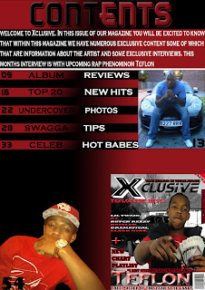
I hadn’t used a photo manipulation software before so using adobe Photoshop (PS) was new and difficult to grasp at first but after practise I swiftly picked up the skills required to produce a front cover, Contents page and a double page spread. Tools used to change and blend colours into each other (gradient) is used within my magazine.
PowerPoint and Microsoft word were software that I was able to use easily as I have been using this type of software long before I began this coursework.
Tuesday, 6 April 2010
Double page spread analysis

This is a double page spread from an issue of NME magazine, featuring British pop/rock artist Lily Allen. Through the useage of dark makeup around the eyes and jet-black hair as well as unglamorous clothing, Lily Allen is portrayed as a traditional rock star. The mise en scene of this image allows us to have an understanding of what type of magazine this is. Lily Allen's posture also represents the stereotypical rockstar, due to her relaxed and uncaring pose. Despite this, she is looking at the camera, thus directly adressing the reader.This double page spread has many atypical traits. One of these is that it only has one image, although it consumes an entire page. The significance of this could be to emphasise and represent the current popularity and importance of Lily Allen. The editor has also structured the spread similar to that of a poster, so that it is aesthetically pleasing, which in turn attracts readers. As a result of
the size of the image of Lily Allen, the interview is limited to a small amount of space. This has the potential to attract a lot of readers many words on a page has less appeal to a reader. In addition to this, the layout of the article’s title looks very attractive as the text is laid out in blocks. The aesthetic appeal of the spread should catch the casual browser’s eye, due to the placement of
the image and title, as well as the limited text.
However, this double page also has typical traits, such as the text being laid out in columns. This makes the text easier to read and follow. Another traditional feature of the magazine is that it has a direct mode of address. It is vital that a direct mode of address is obtained within the interview, so that the reader feels more involved and thu
thus more entertained. The text also maintains its appeal to its target audience, which keeps the reader satisfied.


